
This one is giving me a headache.. Perhaps I'm just missing something silly, hope you guys can help.
The whole html element has a width of approximately 80% of the screen on mobile devices.
On a laptop, reducing the screen size does not replicate the problem. The html will be full size as expected.
Here's the link of the app so you can see by yourself : https://kaayo.vercel.app/
I tried debugging with android devtools and this is what it shows:
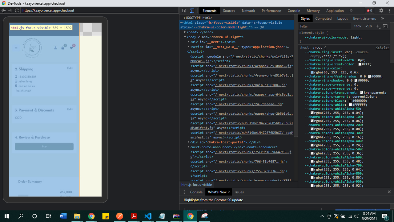
And finally, here's my chakraTheme.js:
global: {
      "html, body": {
        color: "gray.600",
        margin: "0",
        padding: "0",
        lineHeight: "tall",
        fontWeight: "400",
        backgroundColor: "bg.100",
      },
      body: { minHeight: "100vh" },
      "input:focus": {
        borderColor: "primary.200!important",
      },
      "a:hover": {
        textDecoration: "none",
      },
      ':focus:not(:focus-visible):not([role="dialog"]):not([role="menu"])': {
        boxShadow: "none !important",
      },
    },
If you need anything else just tell me.
Thank you for your help!