
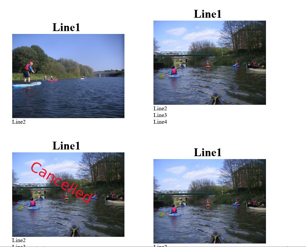
I'm trying to set out a grid of what will be buttons. Each contains an image and some text. I want it to change the number of pictures in a row to suit the window width, so for example on a PC I might get 3 across, while a phone will show one column. I've got test code working, apart from an irritation. As you will see from the test, the pictures are bottom-aligned to the captions. This looks clumsy and would be better if the tops were aligned. http://www.adamshome.org.uk/images/ButtonPhoto.jpg
<html>
<head>
<title> test buttons </title>
<style>
 body { font-size:100%; }
 .heading { font-weight: bold; font-size: 2em; text-align: center; }
 #container {
   display: block;
   width: 100%;
   position: relative;
   /* border: solid 1px green; */
 }
 .item {
   display: inline-block;
   position: relative;
   width: 380px;
   margin: 3px;
   /* border: solid 1px red; */
   align: top;
 }
</style>
</head>

<body>
<div id="container">

  <div class="item">
    <figure >
    <figcaption class='heading' >Line1</figcaption>
    <img src='images/PICT0071.JPG' style='width:310px'>
    <figcaption>Line2</figcaption>
    </figure>
  </div>

  <div class="item">
    <figure >
    <figcaption class='heading' >Line1</figcaption>
    <img src='images/RiverTripPic.jpg' style='width:310px'>
    <figcaption>Line2<br>Line3<br>Line4</figcaption>
    </figure>
  </div>

  <div class="item">
    <figure >
    <figcaption class='heading' >Line1</figcaption>
    <img src='images/CancelledRiverTripPic.jpg' style='width:310px'>
    <figcaption>Line2<br>Line3<br>Line4<br>Line5</figcaption>
    </figure>
  </div>

  <div class="item">
    <figure >
    <figcaption class='heading' >Line1</figcaption>
    <img src='images/RiverTripPic.jpg' style='width:310px'>
    <figcaption>Line2<br>Line3<br>Line4</figcaption>
    </figure>
  </div>

</div>

</body>
</html>