
I have been looking for a reliable component with a clear API documentation that would allow me to display a "tree view" structure for a select input as part of a form. The closest I have came across is vue-treeselect with many supported features such as: disabling branch nodes, disable item selection and more; the issue is that it's only available on Vue JS. My project is using Material UI as its design system, any component that supports it would be very great. Thanks
4 Answers
I needed a to deal with tree data in a project as well. I ended up creating MUI Tree Select.
You can demo it in this sandbox.
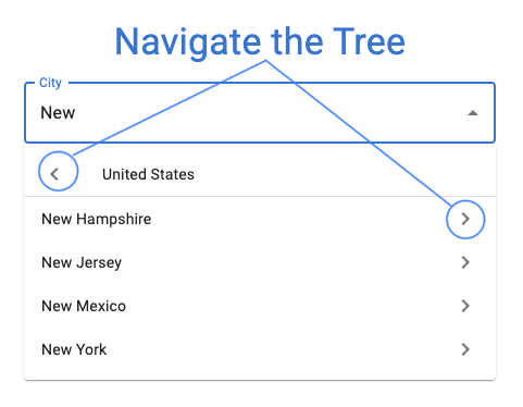
You can install this library here. it cover both reactive forms and ngforms too Check this out https://www.npmjs.com/package/mat-tree-select-input
Probably this is what you are looking for: https://github.com/dowjones/react-dropdown-tree-select (it also has a theme for mui like style)
I searched a lot for that in the end I made this by myself sandbox. you can choose to parent or child with this and you can custom it easily.
    import { ThemeProvider, createTheme } from "@mui/material/styles";
import React, { useState } from "react";
import ReactDOM from "react-dom";
import TreeItem from "@mui/lab/TreeItem";
import { Popover, TextField, Typography } from "@mui/material";
import clsx from "clsx";
import { TreeView, useTreeItem } from "@mui/lab";
import ExpandMoreIcon from "@mui/icons-material/ExpandMore";
import ChevronRightIcon from "@mui/icons-material/ChevronRight";
import { useMediaQuery } from "@mui/material";
const data = [
  {
    id: "root",
    name: "Parent",
    children: [
      {
        id: "1",
        name: "Child - 1"
      },
      {
        id: "3",
        name: "Child - 3",
        children: [
          {
            id: "4",
            name: "Child - 4"
          }
        ]
      }
    ]
  },
  {
    id: "1root",
    name: "Parent1",
    children: [
      {
        id: "5",
        name: "Child - 1-1"
      },
      {
        id: "7",
        name: "Child - 3-1",
        children: [
          {
            id: "8",
            name: "Child - 4-1"
          }
        ]
      }
    ]
  }
];
const CustomContent = React.forwardRef(function CustomContent(props, ref) {
  const {
    classes,
    className,
    label,
    nodeId,
    icon: iconProp,
    expansionIcon,
    displayIcon
  } = props;

  const {
    disabled,
    expanded,
    selected,
    focused,
    handleExpansion,
    handleSelection,
    preventSelection
  } = useTreeItem(nodeId);

  const icon = iconProp || expansionIcon || displayIcon;

  const handleMouseDown = (event) => {
    preventSelection(event);
  };

  const handleExpansionClick = (event) => {
    handleExpansion(event);
  };

  const handleSelectionClick = (event) => {
    handleSelection(event);
  };

  return (
    // eslint-disable-next-line jsx-a11y/no-static-element-interactions
    <div
      className={clsx(className, classes.root, {
        [classes.expanded]: expanded,
        [classes.selected]: selected,
        [classes.focused]: focused,
        [classes.disabled]: disabled
      })}
      onMouseDown={handleMouseDown}
      ref={ref}
      style={{ padding: "3px 0" }}
    >
      <div onClick={handleExpansionClick} className={classes.iconContainer}>
        {icon}
      </div>
      <Typography
        onClick={handleSelectionClick}
        component="div"
        className={classes.label}
      >
        {label}
      </Typography>
    </div>
  );
});
const CustomTreeItem = (props) => (
  <TreeItem ContentComponent={CustomContent} {...props} />
);

export default function RichObjectTreeView({ formik, edit }) {
  const [anchorEl, setAnchorEl] = React.useState(null);
  const [equipmentItem, setEquipmentItem] = useState("");
  const [equipmentId, setEquipmentId] = useState("");
  const handleClick = (event) => {
    setAnchorEl(event.currentTarget);
  };

  const handleClose = () => {
    setAnchorEl(null);
  };

  const open = Boolean(anchorEl);
  const id = open ? "simple-popover" : undefined;

  const renderTree = (nodes) => (
    <CustomTreeItem key={nodes.id} nodeId={nodes.id} label={nodes.name}>
      {Array.isArray(nodes.children)
        ? nodes.children.map((node) => renderTree(node))
        : null}
    </CustomTreeItem>
  );

  return (
    <>
      <TextField
        variant="standard"
        required={false}
        label="Equipment Item"
        name="equipmentItem"
        id="equipmentItem"
        defaultValue={equipmentItem}
        value={equipmentItem}
        className="w-100"
        inputProps={{ readOnly: !edit }}
        onClick={handleClick}
      />

      <Popover
        id={id}
        open={open}
        anchorEl={anchorEl}
        onClose={handleClose}
        anchorOrigin={{
          vertical: "bottom",
          horizontal: "left"
        }}
      >
        <TreeView
          aria-label="icon expansion"
          defaultSelected={equipmentId}
          selected={equipmentId}
          defaultCollapseIcon={<ExpandMoreIcon />}
          defaultExpandIcon={<ChevronRightIcon />}
          onNodeSelect={(e, id) => {
            setEquipmentId(id);
            setEquipmentItem(e.target.innerText);
          }}
          sx={{
            height: 200,
            flexGrow: 1,
            minWidth: "200px",
            overflowY: "auto"
          }}
        >
          {data.map((item, i) => renderTree(item))}
        </TreeView>
      </Popover>
    </>
  );
}
Related