How to compare two data series in one bar using matplotlib

Viewed 744

I want to compare the number of survivors with gender. I have something like:

Name, Survived, Sex
John, 0, male
Ana, 1, female
Leo, 1, male
Peter, 0, male

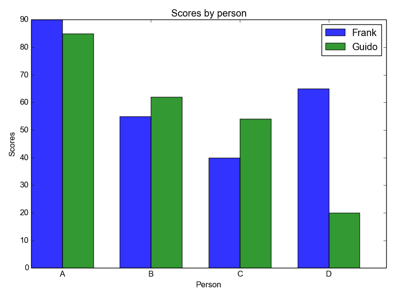
And trying to create a bar chart which should look like here: https://pythonspot.com/wp-content/uploads/2015/07/barchart_python.png.webp

I tried this way

import pandas as pd
from matplotlib import pyplot as plt
import numpy as np

data = pd.read_csv('titanic_data/train.csv')


figure1 = plt.bar(range(4), data[data['Sex']=='male']['Survived'].value_counts(), label='Male')
figure2 = plt.bar(range(4), data[data['Sex']=='female']['Survived'].value_counts(), label='Female')
plt.legend()
plt.xticks(np.arange(4), rotation=0)
plt.title("Third class survivors")

plt.show()

But it says "ValueError: shape mismatch: objects cannot be broadcast to a single shape". What should I do?

2 Answers

There are two problems:

First: You have extra whitespace in your column names while reading the values from your csv file. To get rid of these, you can use skipinitialspace=True

Second: You are using range(4) for plotting the bars, whereas you have only two bars for both male and female categories. As a result you get "ValueError: shape mismatch. Therefore, it is better to use the length of male and female counts

import pandas as pd
from matplotlib import pyplot as plt
import numpy as np

data = pd.read_csv('titanic_data/train.csv', skipinitialspace=True)

males = data[data['Sex']=='male']['Survived'].value_counts()
females = data[data['Sex']=='female']['Survived'].value_counts()

figure1 = plt.bar(range(len(males)), males, align='edge', width=0.4, label='Male')
figure2 = plt.bar(range(len(females)), females, align='edge', width=-0.4, label='Female')
plt.legend()
plt.xticks(np.arange(len(males)), rotation=0)
plt.title("Third class survivors")

plt.show()

enter image description here

You can also simply use the groupby method with your example data:

Name, Survived, Sex
John, 0, male
Ana, 1, female
Leo, 1, male
Peter, 0, male
df.groupby(by=' Sex')[' Survived'].plot.hist()
plt.xticks([0, 1])
plt.legend()

which produce:

enter image description here

Related