
I am currently using a 1D convolutional neural network to classify multivariate time series in Keras. In particular, each instance is represented by 9, equal-length time series (300 points each).
As I have read in the literature, when using 2D convolutions over images, it is possible to get a hint on where the network is looking in order to get to a classification: you may use, for example, the so called Class Activation Map, for example:
https://rajpurkar.github.io/mlx/visualizing-cnns/class_activation_maps.png
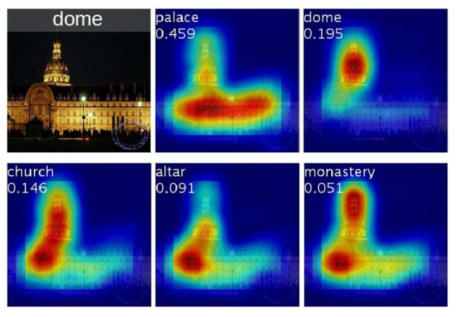
Is there anything similar that I could use to visualize the most "meaningful" slices in a given multivariate time series?
This is my current network architecture:
Input shape: 300 9
_________________________________________________________________
Layer (type)                 Output Shape              Param #
=================================================================
conv1d_1 (Conv1D)            (None, 292, 128)          10496
_________________________________________________________________
batch_normalization_1 (Batch (None, 292, 128)          512
_________________________________________________________________
activation_1 (Activation)    (None, 292, 128)          0
_________________________________________________________________
max_pooling1d_1 (MaxPooling1 (None, 58, 128)           0
_________________________________________________________________
conv1d_2 (Conv1D)            (None, 50, 128)           147584
_________________________________________________________________
batch_normalization_2 (Batch (None, 50, 128)           512
_________________________________________________________________
activation_2 (Activation)    (None, 50, 128)           0
_________________________________________________________________
max_pooling1d_2 (MaxPooling1 (None, 10, 128)           0
_________________________________________________________________
flatten_1 (Flatten)          (None, 1280)              0
_________________________________________________________________
dense_1 (Dense)              (None, 300)               384300
=================================================================
Total params: 543,404
Trainable params: 542,892
Non-trainable params: 512
_________________________________________________________________
As for now, I have succeeded just in visualizing the activation functions in the network. For instance, the following code snippet prints the result of the first activation function (1st over 128) in the first activation layer, given an input instance:
from keras import models

layer_outputs = [layer.output for layer in model.layers[:2]]
activation_model = models.Model(inputs=model.input, outputs=layer_outputs)
activations = activation_model.predict(X_train_windows[0:1])
first_layer_activation = activations[0]
print(first_layer_activation.shape)

plt.plot(first_layer_activation[0, :, 0])
The result is the following time series, of length 292:
https://i.ibb.co/TqK6g9D/Schermata-2019-01-15-alle-10-24-39-2.png

However, I find it very difficult to intuitively interpret the graph.
How can I give a meaning to such a time series? Is there a way instead to highlight the input as it is done in CAMs?
Thank you!