Inline elements shifting when made bold on hover

Viewed 212916

I created a horizontal menu using a HTML lists and CSS. Everything works as it should except when you hover over the links. You see, I created a bold hover state for the links, and now the menu links shift because of the bold size difference.

I encounter the same problem as this SitePoint post. However, the post does not have proper solution. I've searched everywhere for a solution and can't find one. Surely I can't be the only one trying to do this.

Does anyone have any ideas?

P.S: I don't know the width of the text in menu items so I cannot just set the width of the li items.

.nav { margin: 0; padding: 0; }
.nav li { 
    list-style: none; 
    display: inline; 
    border-left: #ffffff 1px solid; 
}
.nav li a:link, .nav li a:visited { 
    text-decoration: none; 
    color: #000; 
    margin-left: 8px; 
    margin-right: 5px; 
}
.nav li a:hover{ 
    text-decoration: none; 
    font-weight: bold; 
}
.nav li.first { border: none; }
<ul class="nav">
    <li class="first"><a href="#">item 0</a></li>
    <li><a href="#">item 1</a></li>
    <li><a href="#">item 2</a></li>
    <li><a href="#">item 3</a></li>
    <li><a href="#">item 4</a></li>
</ul>
30 Answers

Pre-set the width by using an invisible pseudo-element which has the same content and styling as the parent hover style. Use a data attribute, like title, as the source for content.

li {
    display: inline-block;
    font-size: 0;
}

li a {
    display:inline-block;
    text-align:center;
    font: normal 16px Arial;
    text-transform: uppercase;
}

a:hover {
    font-weight:bold;
}

/* SOLUTION */
/* The pseudo element has the same content and hover style, so it pre-sets the width of the element and visibility: hidden hides the pseudo element from actual view. */
a::before {
    display: block;
    content: attr(title);
    font-weight: bold;
    height: 0;
    overflow: hidden;
    visibility: hidden;
}
<ul>
    <li><a href="#" title="height">height</a></li>
    <li><a href="#" title="icon">icon</a></li>
    <li><a href="#" title="left">left</a></li>
    <li><a href="#" title="letter-spacing">letter-spacing</a></li>
    <li><a href="#" title="line-height">line-height</a></li>
</ul>

If you cannot set the width, then that means the width will change as the text gets bold. There is no way to avoid this, except by compromises such as modifying the padding/margins for each state.

If you don't want to preset the width of the list items, a really good alternative would be to try using a uniwidth font in your list items.

Unlike a monospace font, they're still proportional typefaces -- but they occupy the same size across different font weights. No CSS, JS, or fancy hacks are required to keep the size constant. It's baked right into the typeface.

I think it's a really elegant solution to this common problem.

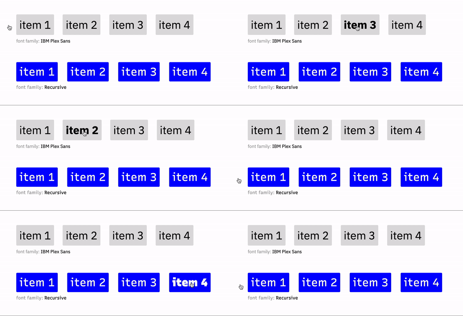
Here's an example from this excellent article comparing the proportional font IBM Plex Sans to the uniwidth Recursive.

comparing proportional to uniwidth font

Notice how in the proportional font (IBM Plex Sans), the list items shift as they change size in the bold typeface. With the uniwidth font Recursive, the items become bold on hover but don't change size.

Free uniwidth fonts you can try are:

There are also many non-free options linked to via the aforementioned article.

I use text-shadow solution as some others mentioned here:

text-shadow: 0 0 0.01px;

the difference is that I do not specify shadow color, so this solution is universal for all font colors.

You can work with the "margin" property:

li a {
  margin: 0px 5px 0px 5px;
}

li a:hover {
  margin: 0;
  font-weight: bold;
}

Just make sure that the left and right margin are big enough so the extra space can contain the bold text. For long words, you might choose different margins. It's just another workaround but doing the job for me.

An alternative approach would be to "emulate" bold text via text-shadow. This has the bonus (/malus, depending on your case) to work also on font icons.

   nav li a:hover {
      text-decoration: none;
      text-shadow: 0 0 1px; /* "bold" */
   }

Kinda hacky, although it saves you from duplicating text (which is useful if it is a lot, as it was in my case).

I would advice against switching fonts(°) on hover. In this case it's just the menu items moving a bit, but I've seen cases where the complete paragraph gets reformatted because the widening causes an extra word wrap. You don't want to see this happen when the only thing you do is move the cursor; if you don't do anything the page layout should not change.

The shift can also happen when switching between normal and italic. I would try changing colors, or toggle underline if you have room below the text. (underlining should stay clear from the bottom border)

I would be boo'd if I used switching fonts for my Form Design class :-)

(°) The word font is often misused. "Verdana" is a typeface, "Verdana normal" and "Verdana bold" are different fonts of the same typeface.

Use letter-spacing with text-shadow:

a {
  letter-spacing: .1em;
}

a:hover {
  text-shadow: 0 0 .9px #color, 0 0 .9px #color, 0 0 .9px #color;
}

I solved this with few lines of javascript.

$('a.menu_item').each(function() {
    let width = $(this).width();
    $(this).css('width',width + 'px');
});

Seeing a lot of great but very involved answers here. There's really not a need for resetting widths, adding hidden elements, reworking elements for different layout declarations, etc. The simplest solution is just to account for the increase in size from the bold text by adjusting the font size in the hover declaration to a slightly smaller size. Like for example font-size: .985em from the normal 1em declaration, which allows the text to bold when hovered but also maintain the original size appearance.

It's better to use a::before instead a::after like this:

.breadcrumb {
  margin: 0;
  padding: 0;
  list-style: none;
  overflow: hidden;
}

.breadcrumb li, 
.breadcrumb li a {
  display: inline-block;
}

.breadcrumb li:not(:last-child)::after {
  content: '>'; /* or anything else */
  display: inline-block;
}

.breadcrumb a:hover {
  font-weight: bold;
}

.breadcrumb a::before {
  display: block;
  content: attr(data-label);
  font-weight: bold;
  height: 0;
  overflow: hidden;
  visibility: hidden;
}
<ul class="breadcrumb">
  <li><a data-label="one" href="https://www.google.fr/" target="_blank">one</a></li>
  <li><a data-label="two" href="https://duckduckgo.com/" target="_blank">two</a></li>
  <li><a data-label="three" href="#">three</a></li>
</ul>

For more details: https://jsfiddle.net/r25foavy/

I fixed menu when hover bold success. It support responsive, this is my code:

(function ($) {
'use strict';

$(document).ready(function () {
    customWidthMenu();
});
$(window).resize(function () {
    customWidthMenu();
});
function customWidthMenu() {
    $('ul.nav li a').each(function() {
        $(this).removeAttr('style');
        var this = $(this);
        var width = this.innerWidth();
        this.css({'width': width + 12});
    });
}})(jQuery);

I can advise you two variants

The first option: is you set the width of each list item to %

Here is a simple example

<ul>
  <li><a href="#">First Item</a></li>
  <li><a href="#">Second Item</a></li>
  <li><a href="#">Third Item</a></li>
  <li><a href="#">Fourth Item</a></li>
</ul>

li {
  list-style-type: none;
  display: inline-block;
  width: 24%;
}

a {
  text-decoration: none;
  color: #333;
  font-size: 1.4em;
  background: #A5C77F;
  display: block;
  padding: 10px 15px;
  margin: 10px 0;
  border-right: 1px solid whitesmoke;
  transition: font-weight .3s;
}

a:hover {
  font-weight: bold;   
}

The second option: is to use a text-shadow on the active element

text-shadow: 0 0 .65px #333, 0 0 .65px #333;

But I recommend using the first option, that is, specifying the width as a percentage for each element, since text-shadow does not always work in mobile browsers

I really can't stand it when someone tells you not to do something that way when there's a simple solution to the problem. I'm not sure about li elements, but I just fixed the same issue. I have a menu consisting of div tags.

Just set the div tag to be "display: inline-block". Inline so they sit next to each other and block to that you can set a width. Just set the width wide enough to accomodate for the bolded text and have the text center aligned.

(Note: It seems to be stripping out my html [below], but each menu item had a div tag wrapped around it with the corrasponding ID and the class name SearchBar_Cateogory. ie: <div id="ROS_SearchSermons" class="SearchBar_Category">

HTML (I had anchor tags wrapped around each menu item, but i wasn't able to submit them as a new user)

<div id="ROS_SearchSermons" class="SearchBar_Cateogry bold">Sermons</div>|
<div id="ROS_SearchIllustrations" class="SearchBar_Cateogry">Illustrations</div>|
<div id="ROS_SearchVideos" class="SearchBar_Cateogry">Videos</div>|
<div id="ROS_SearchPowerPoints" class="SearchBar_Cateogry">PowerPoints</div>|
<div id="ROS_SearchScripture" class="SearchBar_Cateogry">Scripture</div>|

CSS:

#ROS_SearchSermons { width: 75px; }
#ROS_SearchIllustrations { width: 90px; }
#ROS_SearchVideos { width: 55px; }
#ROS_SearchPowerPoints { width: 90px; }
#ROS_SearchScripture { width: 70px; }

.SearchBar_Cateogry
{
    display: inline-block;
    text-align:center;
}

try this:

.nav {
  font-family: monospace;
}
Related