
I am trying to create a Gantt chart which involves planned and actual start/end dates. I would like same tasks to overlap like:
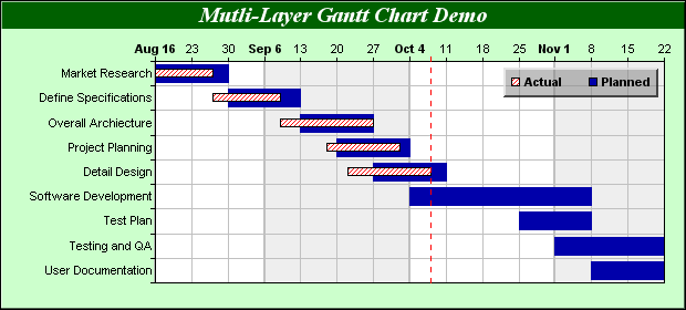
So far this is my code.
import plotly.figure_factory as ff
import pandas as pd

df = pd.DataFrame([
    dict(Task="Job A", Start='2009-01-01', Finish='2009-02-28'),
    dict(Task="Job A", Start='2009-01-05', Finish='2009-02-15'),
    dict(Task="Job C", Start='2009-02-20', Finish='2009-05-30')
])
colors = {'Job A': 'rgb(220, 0, 0)',
          'Job C': (1, 0.9, 0.16), }

fig = ff.create_gantt(df, colors=colors, index_col="Task", show_colorbar=True, group_tasks=True)
fig.update_yaxes(autorange="reversed")  # otherwise tasks are listed from the bottom up
fig.show()
This is the result:

How do I distinguish planned v. actual dates? Python, R and Excel solutions are welcome. Usage of Plotly in solutions is completely optional.

